Labels

Wednesday, April 11, 2012

Response: Meredith presentation

The Meredith presentation this week was a really fun experience.  It was the first time I had seen our magazine in full. 

In the beginning I was nervous that our designs didn't all flow well together.  However, after revisions, I'm really happy with "Eat Now."  Our biggest design challenges seemed to stem from miscommunication with the publishing group.  After those are sorted out I know we'll all have a project to be proud of and include in our portfolios.

My individual pages may change in content.  We are thinking of cutting a few drinks from the feature to keep the page lengths reasonable.  Also, I'm going to try to incorporate a food item onto the splash page.


The shrimp cocktail and steak icons have just been added.

Any ideas on how to incorporate some food images on this page?


Monday, April 9, 2012

See this: Welcome to Fabulous Las Vegas!

I was going through google images to find my favorite image of the Vegas welcome sign when I stumbled upon (not literally) this great compilation of photographs of it.


Studio d'Xavier

Pinky-Lee

RickyBarnard


In doing our 20/10 assignment, we've had to think of many ways to capture one idea.  I think these images are a great example of how many perspectives can be had on one subject.  There are hundreds on the website, if you're interested in seeing more.

I've been daydreaming of sunshine, neon and strip(walking) far too long.    Time to go home.  VIVA!

Wednesday, April 4, 2012

See this: Mental Disorder posters

I've always been drawn to illustrative posters and minimalism.  I think I'm a broken record over here, but hey, I know what I like! I love these designs by designer Patrick Smith that cover six mental disorders.


I especially love the Narcolepsy one.  Enjoy!

Response: Meredith Prototypes

My group is rad!

Eat Now had some problems looking cohesive on Tuesday, but after our meeting, we're pulling it all together.  The biggest problem was that one of our departments looked like a feature.  That's changed now.

It's really hard working on designing a food magazine, especially late at night because all I want to do is

EAT...


NOW!

But instead of banana split cupcakes and margaritas, my fridge only ever has yogurt and gatorade.

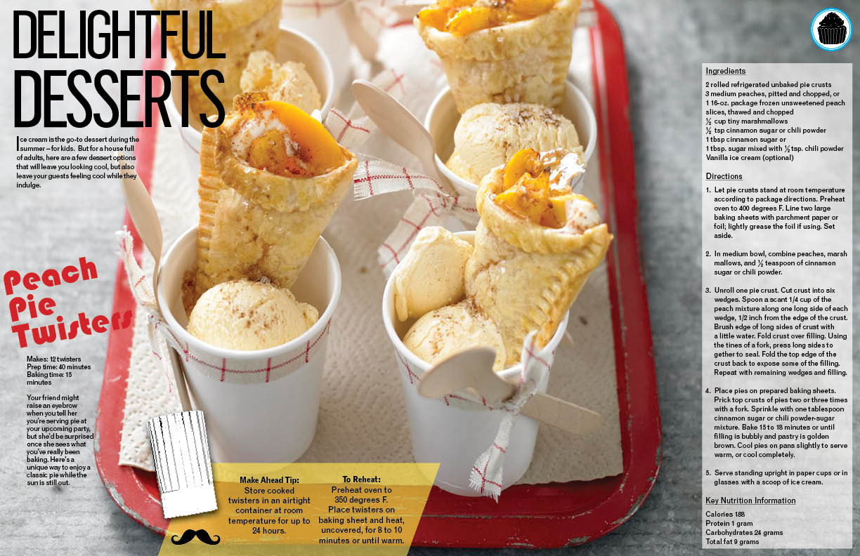
I really like the big blowout photos we used for the feature.  It looks very professional.  I added some quirky extras, such as the chef hat and moustache on the "Tip" pullout and the icons in the right corner that get eaten throughout the pages.  I know my first designs for the cover were a bit much, but this was my way of making the magazine fun and still something that came across as professional and sellable to the Meredith market.

Here is what I've come up with for the splash page of the feature (minus Nick's two icons for entrees and appetizers) and the desserts and drinks spreads.


Critique: Invasive Species

COMING OUT TOMORROW!


I loved working on this feature.  It's a serious topic, but the writing had some fun quotes and the comic theme worked well with the story to keep it playful.

I don't have the final version yet, but you'll see it in tomorrow's VOX.   


After meeting with Theresa, we decided there needed to be more feral hog artwork and more comic elements.   The halftone patterns really pulled the theme together.  I've had a bunch of people ask me how I did it, and I wish I had some long detailed explanation that made me seem really cool and technically savvy, but the halftone pattern was turbo easy.

The background of the pages are just .jpeg files I made in photoshop by choosing the color I wanted and placing a box the same dimensions of the page.  I then added a halftone effect while playing with contrasts and sizing until I came up with the one that looked best to me.

I made the icons in Photoshop as well. They are just cutouts with fill-strokes.  I was lucky enough to find the speech bubble on Stock Xchng and only had to cut it out.  

The giant carp and feral hog cutouts were treated in photoshop with multiple layers and effects.  I found a tutorial online that showed me how to do it: 


///////

That feral hog is actually a wild pig from Stock Xchng.   There weren't any photos for the pig, but the two species are so similar that once I added the photoshop effects there was no telling them apart. 

The changes you'll see tomorrow are:

      a sidebar for "The Plant Problem" and added white boxes behind the text to make it more readable.


CH-ch check it out!

Wednesday, March 21, 2012

See this: Photoshop effects


While browsing some new design blogs this week I came across this cool list of Photoshop effect tutorials on Design M.ag.

While a lot of them are corny and should probably never be used, I do think they would be fun to play with.  I really like the x-ray one!


Response: Society of Publication Designers Awards Finalists

Jan sent us a PDF that had all the winners for this year's design awards.  I was disappointed that the issues weren't linked up, but managed to find some of the feature and cover designs online.   A lof of the magazines featured really surprised me, like Bloomberg Businessweek and Elle Collections (UK).


I was blown away by some of the designs I saw and wanted to include some of my favorites that I found here, just in case you didn't check the e-mail!

Elle UK: Catwalk Colour


I love the organization of the looks by color
ahem* COLOUR
From a design standpoint, these cutouts must have taken ages.  I LOVE IT.
I found these photos on bargainista fashionista.


I always love the design of the New York Times Magazine and was not at all surprised to see them on the list.  

"What Happened to Air France Flight 447?"


"Can The Bulldog Be Saved?"


Bloomberg Businessweek: Crisis in Japan


For all of us designers who may be freaking out about the impending future, I hope you found some inspiration and hope in these covers.  For example, this last Japan cover-- any one in our class could execute it.  What it takes is passion and a kickass idea. 

I believe in us!