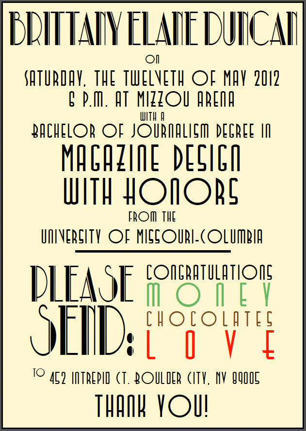
Wednesday, March 21, 2012
See this: Photoshop effects
While browsing some new design blogs this week I came across this cool list of Photoshop effect tutorials on Design M.ag.
While a lot of them are corny and should probably never be used, I do think they would be fun to play with. I really like the x-ray one!
Response: Society of Publication Designers Awards Finalists
Jan sent us a PDF that had all the winners for this year's design awards. I was disappointed that the issues weren't linked up, but managed to find some of the feature and cover designs online. A lof of the magazines featured really surprised me, like Bloomberg Businessweek and Elle Collections (UK).
I was blown away by some of the designs I saw and wanted to include some of my favorites that I found here, just in case you didn't check the e-mail!
Elle UK: Catwalk Colour
I was blown away by some of the designs I saw and wanted to include some of my favorites that I found here, just in case you didn't check the e-mail!
Elle UK: Catwalk Colour
I love the organization of the looks by color
ahem* COLOUR
From a design standpoint, these cutouts must have taken ages. I LOVE IT.
I found these photos on bargainista fashionista.
I always love the design of the New York Times Magazine and was not at all surprised to see them on the list.
"What Happened to Air France Flight 447?"
"Can The Bulldog Be Saved?"
Bloomberg Businessweek: Crisis in Japan
For all of us designers who may be freaking out about the impending future, I hope you found some inspiration and hope in these covers. For example, this last Japan cover-- any one in our class could execute it. What it takes is passion and a kickass idea.
I believe in us!
Critique: Feature
I'm a nature nerd at heart and was excited when I saw that I was designing the "Invasive Species" feature for the 4/5 issue. Because there weren't many photos to choose from, I started thinking about illustrations. After brainstorming with a friend, this concept of a "godzilla-carp" came up. I looked up some old movie posters and knew I had to go for it.
This was what I came up with:
I treated the fish in Photoshop using a comic-style tutorial I found. I really like the way it came out. The carp was the only thing I kept from the original photos from the server. The background was a pattern I imported from photoshop, and the fish are cutout silhouettes I made from photos on stock xchnge.
It got really good feedback and I'm excited to do the rest of the feature in a similar style.
I'm thinking I'll do another page like this for the FERAL HOG. Dun dun dun.
I didn't notice it looked so similar to the True/False cover until I printed it out at the library. The treatment of the fish is totally different, as well as the way the words are incorporated. I don't want it to in any way relatable to the genius of True/False, so I'm going to take out the starburst background and play with solid colors or continue with the comic-style.
Here's the more serious design for the feature:
If you click on them to make them larger you can see the detailing of the jumping fish, hog's head and plant silhouettes. The black boxes are where I envisioned the photos going once I received them.
However, the photos aren't looking too good, so I think I'll end up doing more with illustrations. I really like the fishing pole in place of the "I" in invasive species, but don't think it will translate well with the first design. The small pullout silhouettes I'll probably keep, but may alter them to look more like the godzilla fish. I'm still playing around with that idea.
Wednesday, March 14, 2012
See this: Fuse magazine
After reading the Just My Type book, I wanted to check out FUSE magazine, Neville Brody's vision that was discussed in the "Breaking the Rules" chapter.
After some research, I couldn't find any website that seemed to be running current issues. There was a lot of buzz a few years ago of Brody redesigning the magazine, but I only found a few covers that seemed to validate this.
The link I provided best explains the redesign of the issue but I want to see it in hard copy somewhere. It seems like such a cool magazine, made for typographers and designers yet dictated by readers and evolving with each issue based off of feedback and ever-changing technology. If anyone else knows more about this, please let me know! In the meantime, I hope you checked out the link and saw some of the innovative things they seemed to be working on.
Critique: Grad announcements
TWO MORE MONTHS!!!
Here's my art deco, 1930's-style graduation announcements. I took a lot of inspiration from our Graphic Style textbook, particularly Swiss advertisements American magazine covers of that period, when coming up with ideas for my own unique announcements. I really like how they came out!
I'm printing them on 4 x 6, ivory card-stock.
Front
Back
I wasn't kidding. I accept chocolate.
Response: Helvetica & Just My Type
Helvetica
Movie poster via Linotype
In keeping with the theme, I'm sure we'll all use said font for this blogpost. I had heard of this movie before but never sought it out to watch. After today, I don't know why I waited so long. I was so into the film AND the typeface, that it was hard to leave for my next class and miss the ending. Helvetica is a font that everyone knows, whether they are aware or not. It's everywhere. When I think of some of my favorite clothing stores, two of them use Helvetica in their branding: American Apparel and Gap. It seems like the perfect modern typeface, as the movie mentioned. What I appreciate about the film is how it didn't just start off with a history of the font, but of designers and typographers talking about it and why they liked it. It was beautifully filmed and quirky, which made it interesting to watch. It is about a font, after all. Then they went through the history. Next, the corporate takeover of the font and the struggle for designers to break away from the craze. I missed the ending, but after forty-five minutes of Helvetica praise, I was thinking the font could do no wrong until just before I left. I'm glad I didn't miss that part because the thought went through my head to rush home and immediately work it into all my designs.
Kidding.
Maybe?
Whether it is the best font in the world or not, no one can argue that any one font has had more recognition and popularity. It's silly to think of fonts as popular, and that as a designer I may very well one day be dreaming of fonts and talking like most of the people interviewed in the film. It's cleanliness and soft curves with that perfect spacing makes it pleasing to the eye in a way that no other font has. Oh gosh, here I go. Anyways, the film did give me a new appreciation for the work of typographers and all the details that go into these typefaces we see every day. I know I can never see Helvetica again without a light-bulb going off, and I'm glad for it. One of my biggest struggles in designing is what fonts to use. I am still a beginner and don't know that much about typefaces, but they are of crucial importance to my career and this movie got me really excited about typography like nothing yet has. I feel like the spark has been ignited!
Just My Type
Chapter 2: CAPITAL OFFENCE
There are far more entertaining chapters in the book, but with a topic as intricate as typefaces and fonts, I think it's best to get some history.
It's like the first day we came into class and Theresa began talking about serifs and sans-serifs. The first time she said that I knew she was talking about fonts, but had no idea exactly what about them. I've come a long way.
The way type looks creates a mood and atmosphere for readers. With Vicki Walker, who got fired for writing a simple e-mail in ALL CAPS, as an example, we must be cognizant of not only what we are saying, but how we are saying it. Typefaces matter. Fonts matter.
Fonts have gender. Generally masculine topics are in bold, heavy and linear. Opposite that are feminine fonts, which are more thin, curvy and oftentimes appear handwritten. I'm not trying to be sexist here. As Garfield mentions, you can change up the system, but how people automatically perceive and make associations from the fonts you use doesn't change.
What I learned from this chapter? Gutenberg's Textura is the world's first font, and thank goodness I didn't have to deal with type back then. It's so easy to select digitalized fonts pre-made for you from the drop box, but back then they had to cut individual letters out of metal, string them together, and add ink. In a way, they knew exactly what they wanted from those fonts. They knew everything about them. These days it takes a careful eye to choose the right font. Which is right may not always be one answer, but there are certainly inappropriate times to use certain fonts. Research becomes crucial for us as designers to make the right choices.
Chapter 9: What is it about the Swiss?
I chose this chapter because:
1. I like Europe.
2. We just watched Helvetica.
3. I can't stop looking at these gold disco shorts from American Apparel.
After the world wars, a new trend towards modernism and practicality swept across Europe. This was especially evident in the use of fonts such as Helvetica and Univers. A line I loved from the movie stated: "Helvetica is like oxygen, you have little choice but to breathe it in. "
As I said above, it's everywhere. What is it about it?
Emotionally, it's like the Swiss. Neutral and fresh.
It conveys honesty without being overbearing.
It's efficient.
But, enough about Helvetica. Univers is the other major Swiss font discussed in chapter nine.
Univers is a more authoritative typeface, and replaced Futura. It's slogan was: "a synthesis of Swiss thoroughness, French elegance and British precision in pattern manufacture."
Other descriptions label it as: the pinnacle of cool European modernism, 'the least bad" sans serif face and a font that lets you go somewhere in safety.
It was invented by Frutiger in 1952 and is used in the metro systems of Paris, Montreal and the London street signs of Westminster. It never gained the status of Helvetica, but neither has any other font.
In short, the Swiss know how to do efficiency beautifully, and although I was always drawn to them before, I'll be paying even closer attention.
Chapter 18: Breaking the Rules
To break the rules you have to first know them. I'm just now really understanding the sacred ground on which great typefaces exist. Maybe it's because we see chaos everywhere do we think we as designers can add to it. While I do want to be creative and think out of the box with type, there are guidelines to consider before getting too crazy.
Don't use too many different ones on a page. Be legible. Don't use ALL CAPS. Etc..
Yeah, yeah.
Fonts were created for different purposes. The book uses Times New Roman as an example, citing its extreme popularity due to its legibility in all different sizes and economical use of space.
However, all that can be a bit boring. So Carter, of Rampant Lions Press, and Bents, of the Chelsea College of Art and Design, proposed a "love letter to disaster." There would be a lot of bad fonts and many failures, but there would also be success stories.
I don't like to conform. I know we all do, but I tend to side with the rebels. The same goes for my type preferences. I'm also tired of perfect type. I find inspiration in typefaces that don't always match their content, such as Be Here Now by Ram Dass, with it's stamped out letters in all sizes and posters with chaotic fonts all over. They may not be the most legible, but they are interesting and make me stop and look more carefully. In that sense, I see them better.
Wednesday, March 7, 2012
Critique: T/F APP
Ohmygoodness.
The story of the True/False Feature App:
Monday-Tuesday: work, work, work, paint, work
I had some problems with communication in getting the final photos until Wednesday morning. Then, I had to leave to get my boyfriend from Kansas City who flew in from Vegas, come back and finish reworking the design with the final text. I was there until 2 a.m.
Erik, you're such a great sport!
9 AM: The phone-call...
I was getting ready to go to editing when Dayne called me and said the horizontal orientation wouldn't open. I opened it on my computer but every time it reached page seven, it crashed the system. That hadn't happened the night before, so I skipped editing and came in to see what could be done. My options were to redo the entire orientation, leave it as is and only have the portrait version or kill the feature.
FRUSTRATION!!
I had been very sleep deprived up until this point and it was my first instinct to just run away and cry, but then I thought that it was such a special issue, and I worked so hard that I would be devastated and disappointed in myself if I didn't fix it.
It was the right decision. I stayed and redid the horizontal version, which ended up not taking too long since I still had the portrait version to work with.
DONE.
Looking back, it was all worth it. I love how it turned out. Thanks a bunch to Kelsey and Krista for their amazing illustrations and work they put into the print feature so the app version could be possible.
I seem to have the first draft of the landscape version on my computer, so just imagine the Tim Hetherington page of the portrait version the same for the landscape.
Portrait
Landscape
Response: Portfolios
Here's some work from my London internship at
These were little pages that went up on their website Lookbook.
I think I've improved!
I also did a lot of photographing and retouching of products
that were put on the website to be sold.
Yes, that's my wrist with the arm candy, as well as my funky fingernails.
I found the portfolio critiques rushed. I hope we get a one-on-one later because after seeing so much work in such little time, I don't know if we were all giving the best possible critiques.
I have to say that I was very impressed with my peers' work. My weakness in my portfolio is that I don't have enough typographic designs, and I got some great inspiration for future assignments from Katie and Krista's portfolios. In particular, I really loved the True/False camera with a the reel made out of words, and same with a fork and strawberry in the same style. I need to find a tutorial on that ASAP!
It was also cool to see a lot of advertising and newspaper designs. I don't have any news design experience, and I think those pieces made those designers' profiles much stronger.
When I was reading the assignment breakdown, I thought we were supposed to bring in 12 examples of work. I didn't want to waste my quota printing the entire True/False feature app, so I failed to include that in my profile, as well as my alternatives for VOX cover designs, webwork from my internship and all of my department pages.
Whoops!
Anyways, I really appreciated the feedback I received and feel that I have a good sense of what to include to make my portfolio stronger before the semester is up. Thanks, all!
Subscribe to:
Posts (Atom)